Case study — Design system
The design system that measures what it claims
A design system designed, built, measured and governed single-handedly, where accessibility is not asserted but computed, component by component, on the prototype as rendered in the browser.
Context
The European Accessibility Act has been in force since June 2025. It makes digital accessibility mandatory for a large share of products sold in Europe, and it rests on a precise technical reference, EN 301 549, which incorporates WCAG 2.2. For a supplier bidding on public contracts, this is no longer a desirable quality. It is a clause.
A design system is where that requirement is settled. It fixes the markup, the states, the focus and the contrasts before a single page exists. Done well, it makes compliance free for the teams that use it. Done badly, it makes them pay the same debt again on every screen.
Problem
Most teams treat accessibility as an end-of-pipeline review. You design, you build, then you audit, and you fix whatever can still be fixed.
The problem is not how serious the teams are, it is the order of operations. By audit time the decisions that matter are already made: the element chosen, the way a state is announced, the contrast of the colour set, the structure of the form. Reworking them is expensive, so not all of them get reworked.
A design system can invert that order. It is the one place where compliance is decided once, upfront, for every team that will use it afterwards. It still has to actually hold, and to be able to show it rather than assert it. That is the system I set out to build: foundations that carry the theme, a catalogue built on native elements, patterns that verify the assembly, and documentation that makes the whole thing usable by someone other than me.
Challenge 01 — Tokens that carry the theme, not just the colours
The challenge: build a token foundation that survives a theme change without anyone touching the components again.
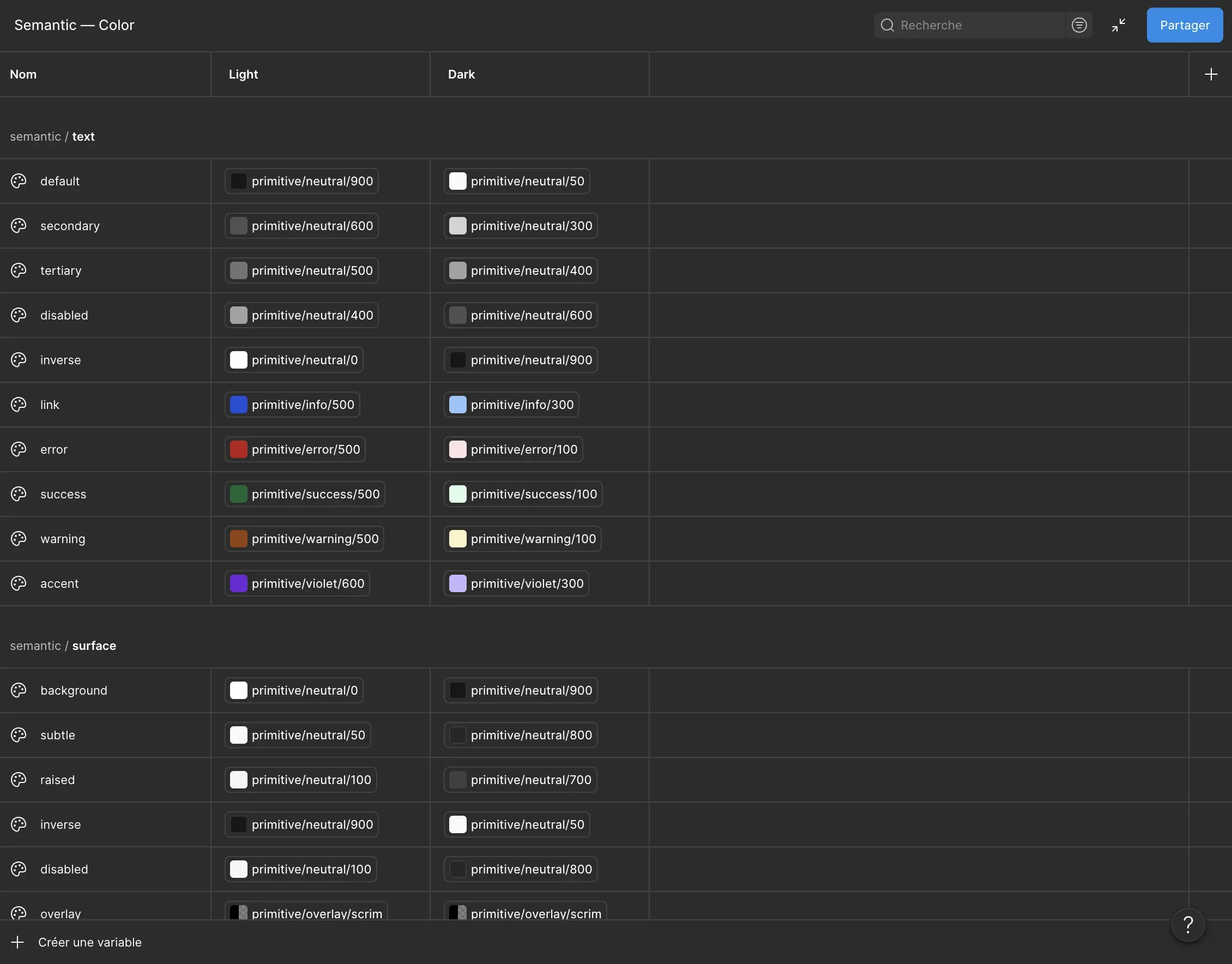
My approach: two strict tiers. Primitives are options
(a palette, a type scale, radii). Semantic tokens are decisions
(surface/background, text/accent,
border/control), and only those are used inside
components. Light and dark modes live at the semantic tier. The source
is Figma, exported in DTCG format to a tokens.css weighing
3.4 KB gzipped, both themes included.
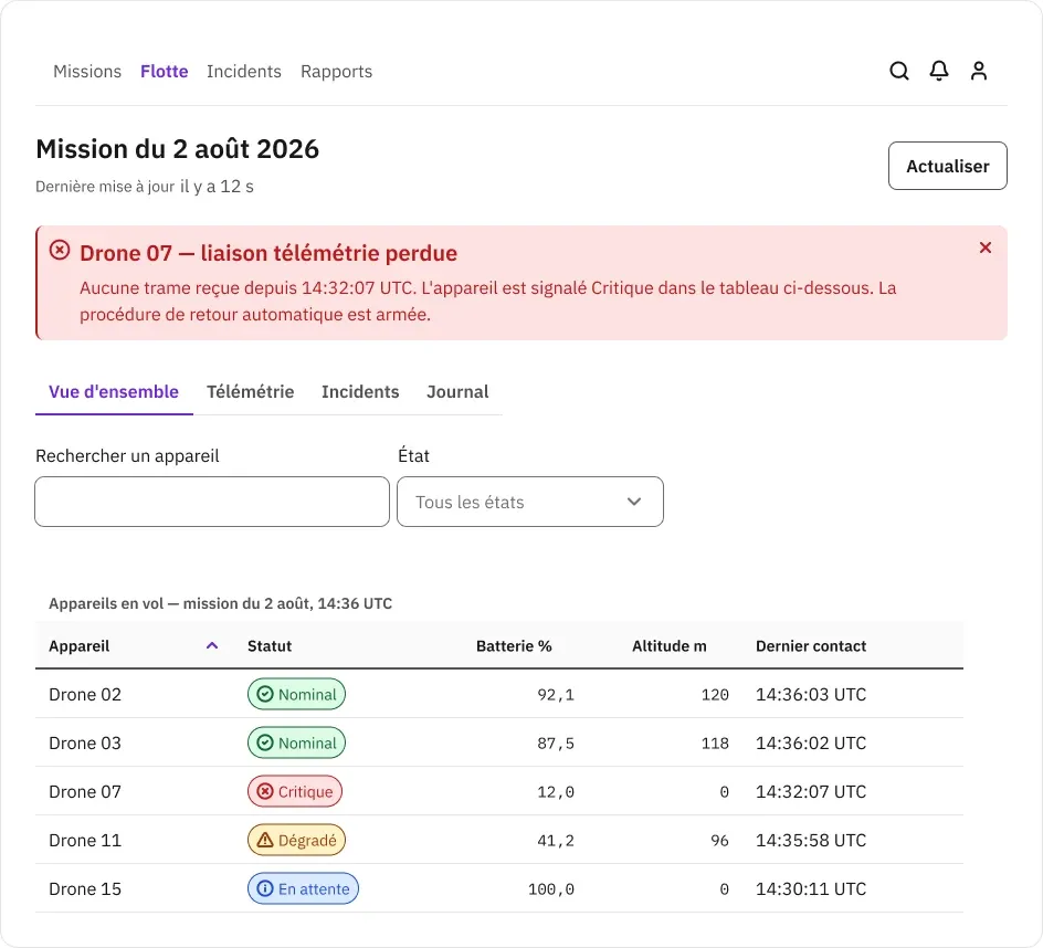
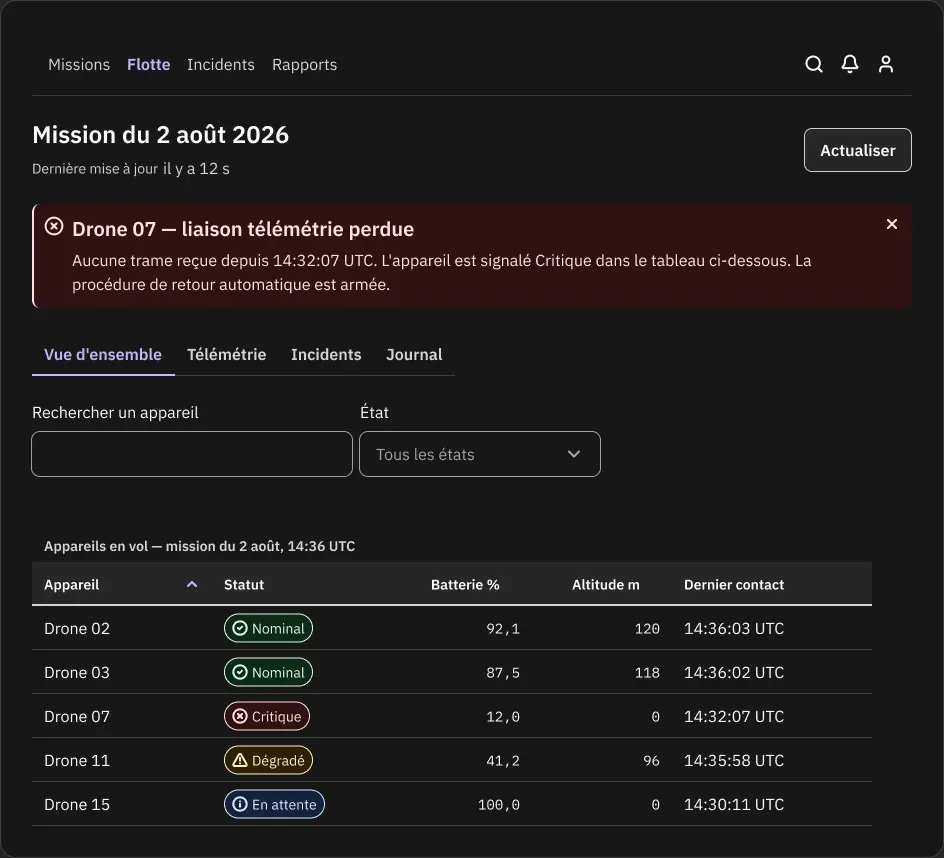
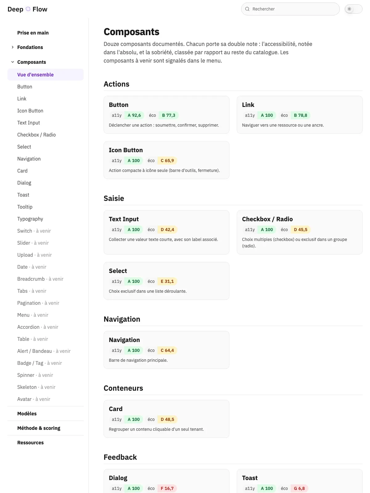
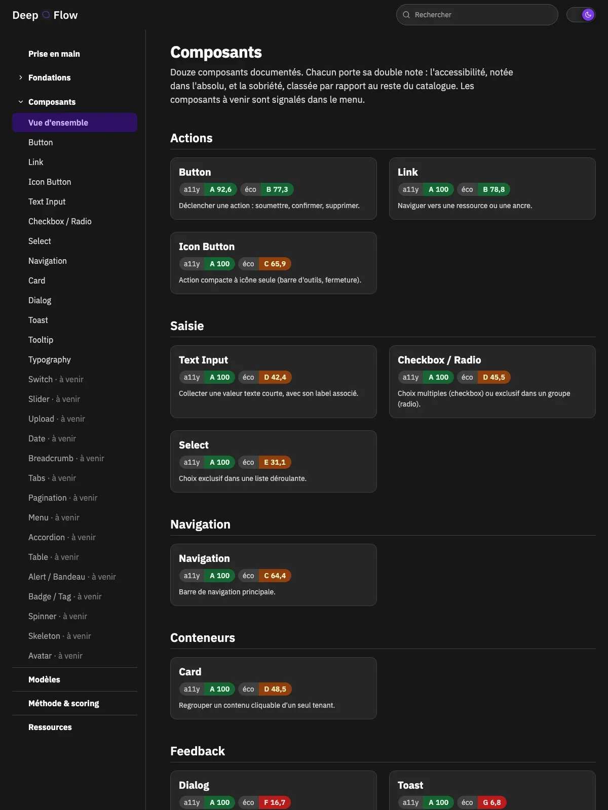
Outcome: the supervision console exists in light and dark. The dark version required no redraw, no re-entered colour, no extra variant. One mode switch, and more than two hundred bindings re-resolve. Contrasts measured after the switch hold AAA, between 9.7:1 and 17.2:1 on text.
Challenge 02 — A catalogue built on native elements
The challenge: deliver a complete catalogue with no dependency, no framework, and without frugality being paid for in accessibility.
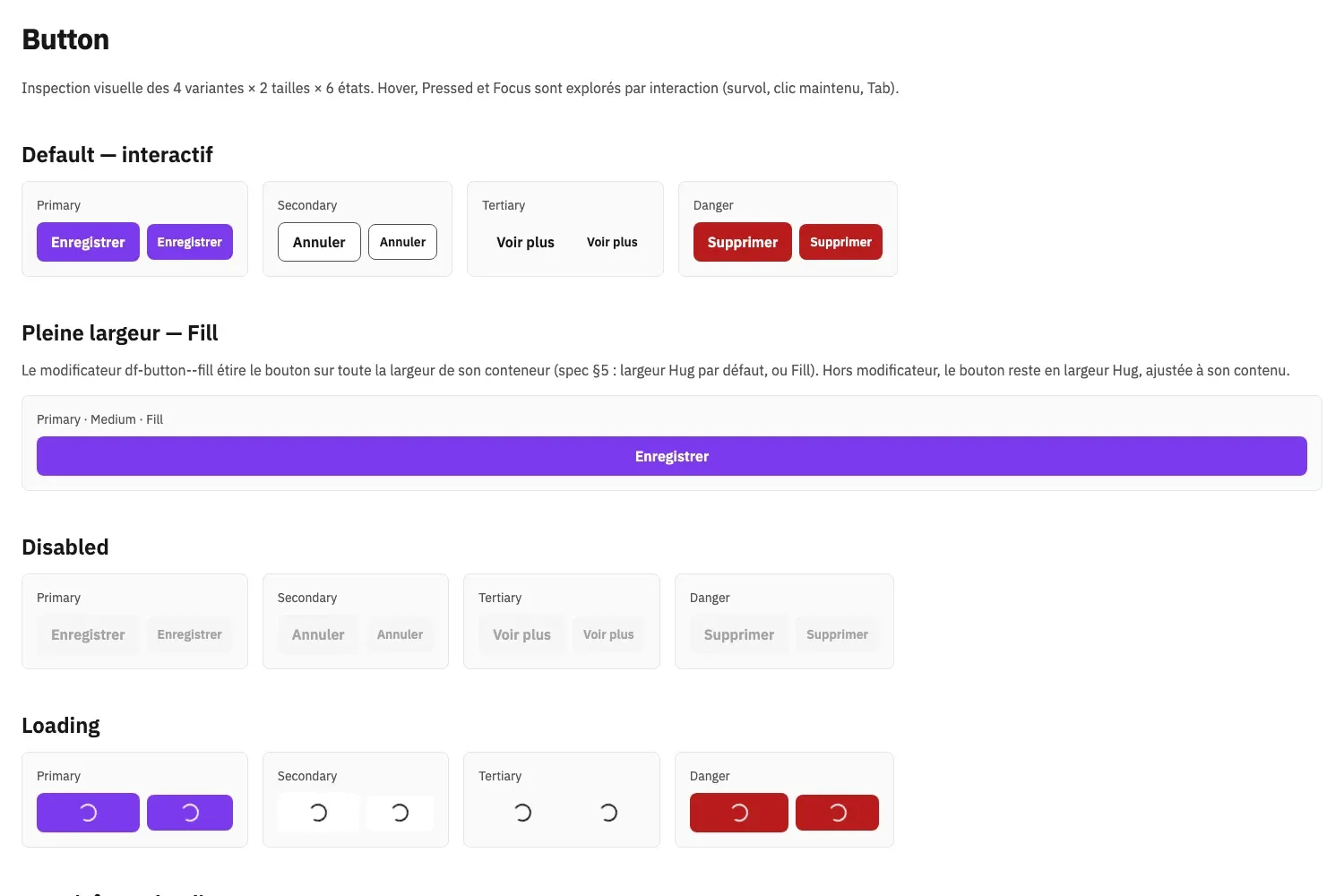
My approach: enforceable rules, written before the first component. Zero npm dependencies. Zero JavaScript framework. No utility CSS library. No JavaScript where HTML and CSS suffice. No hardcoded colour. Focus always visible and offset. A proposal that breaks a rule must be justified explicitly, or refused.
Those rules produced the most interesting trade-offs in the project. The
native <select> beats a custom combobox: you inherit
keyboard support, type-ahead, screen reader behaviour and the mobile
picker for free, at the cost of an unstylable open list. The native
<dialog> with showModal() supplies the
focus trap, focus return, the Escape key and an inert backdrop for two
lines of JavaScript. The fully clickable card uses a stretched link on a
pseudo-element, never a div with a click handler. And when
a field border failed the 1.4.11 contrast criterion, I created a
reusable border/control token rather than patching a local
value: the defect was fixed once, for every component that reused it
afterwards.
Outcome: nine of the twelve prototyped components work without a single line of JavaScript. The three that carry some do so for an irreducible reason, and it shows in the numbers: 606 bytes to open a modal, 698 to make a tooltip dismissible, 1,332 to feed a live region. Each component weighs between 1.1 and 2.9 KB gzipped.
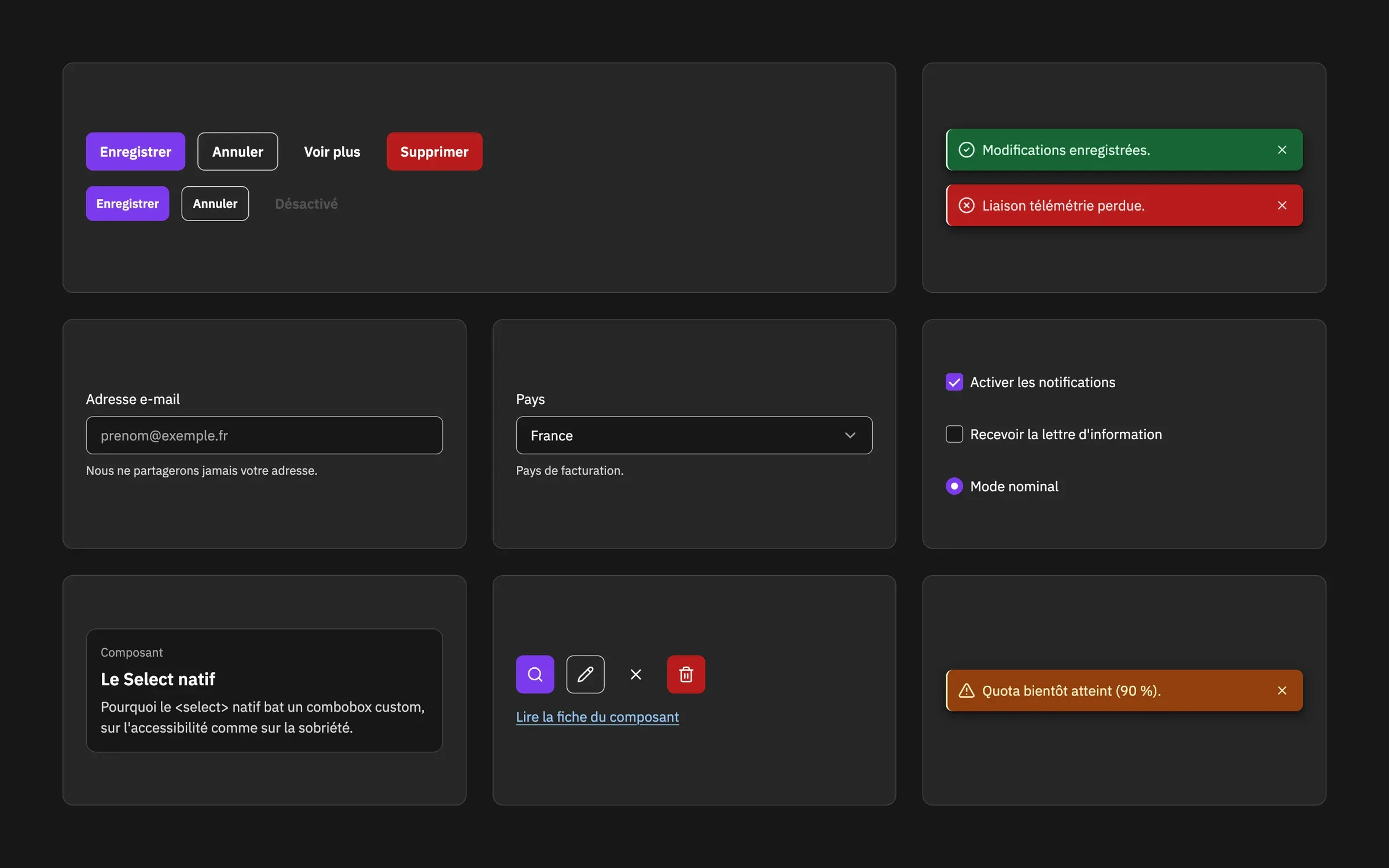
The catalogue now holds seventeen components. The last five were designed for a specific domain, that of operations interfaces: data table, status badge, persistent alert banner, tabs and timestamp. They live in the library, with their variants, states and usage descriptions, and they reuse the same foundations as the first twelve.
Challenge 03 — Criteria verified in the browser, not declared
The challenge: be able to state precisely what is compliant, against which criteria, with which tool, and on which date. "Our components are accessible" is not an acceptable answer in a tender response.
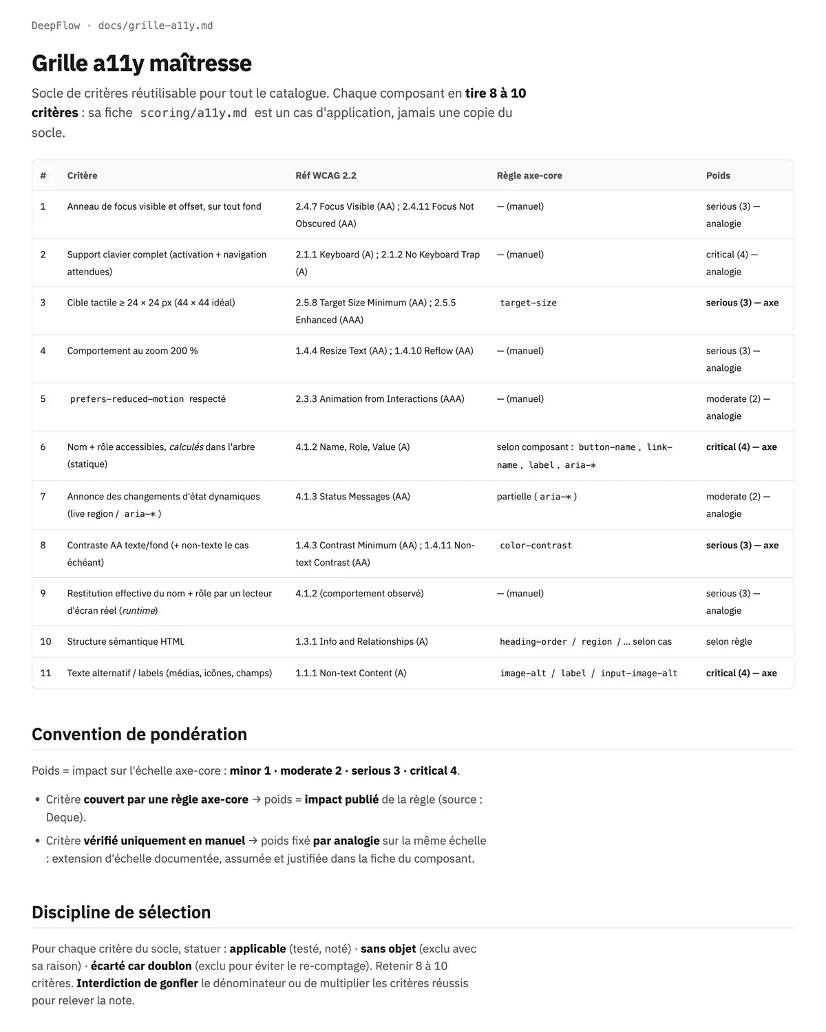
My approach: a grid of criteria drawn from WCAG 2.2, applied component by component. Each component retains eight to ten, and for each one a ruling is required: applicable, not applicable, or discarded because another criterion already covers it. Visible focus, full keyboard support, touch target size, behaviour at 200% zoom, accessible name and role, contrast of both text and interface elements, announcement of state changes.
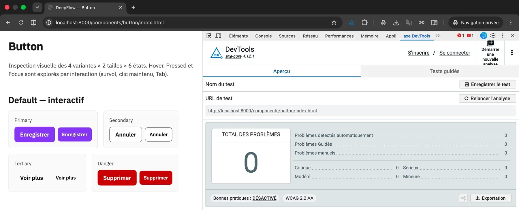
Verification happens in a browser, on the rendered prototype, never by static analysis alone: axe DevTools for what can be automated, Lighthouse as corroboration, then keyboard, zoom and VoiceOver for everything else. Automated checkers cover only part of the criteria; the rest is tested by hand, or not tested at all.
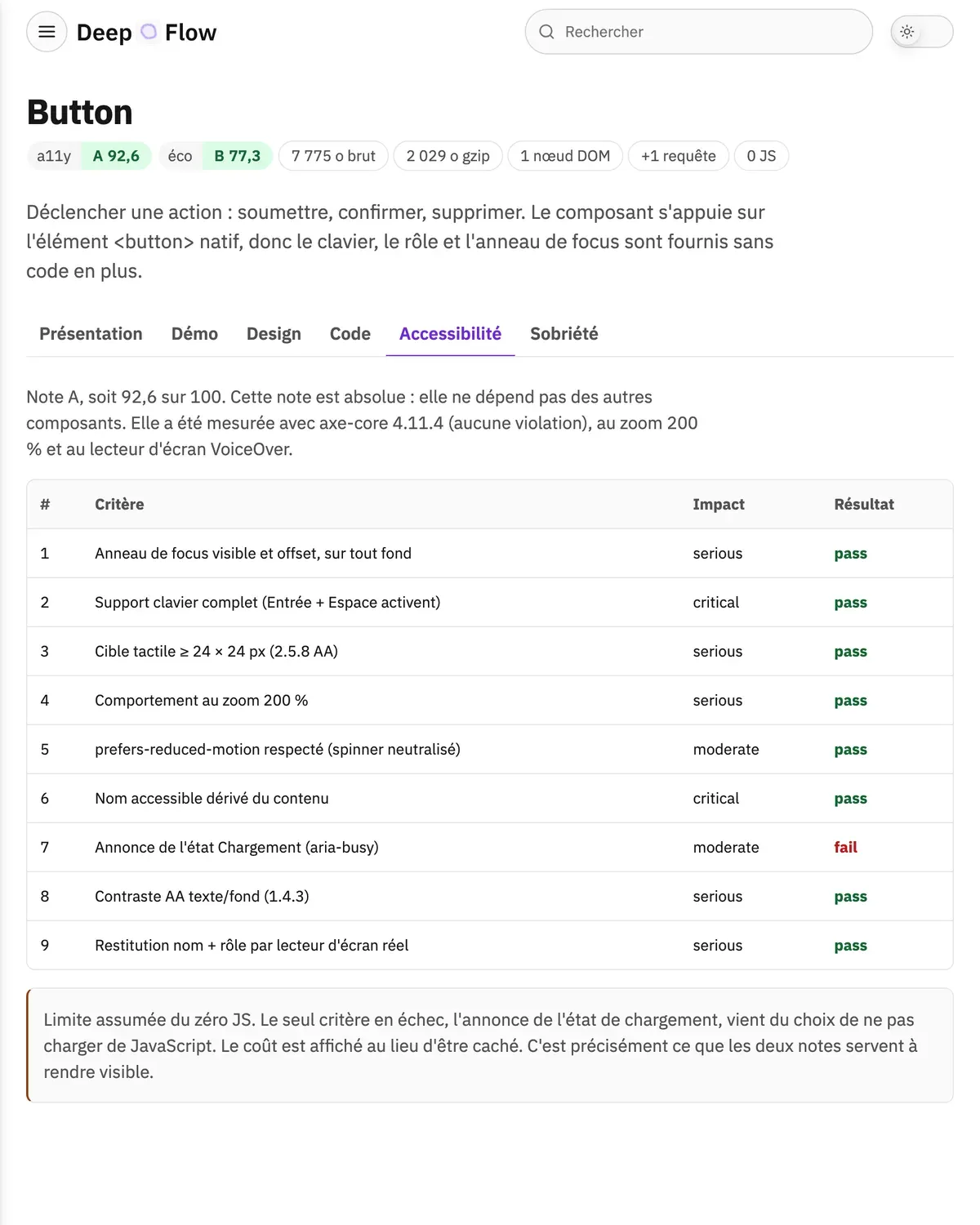
Outcome: zero axe-core 4.11.4 violations across the prototyped catalogue, confirmed in the browser and dated. The grid also produces a grade per component, which serves to locate where the system is weak rather than to award itself a label. Only one component falls short of the maximum: the Button, which without JavaScript does not announce its loading state change. The limit is accepted, but it is counted. A grid that had found nothing would have proved nothing.
Each component also carries a second grade, for weight, built on three variables measured on the rendered prototype: DOM complexity, own requests, bytes transferred. It is deliberately kept apart from the first. A single indicator would have dissolved the tensions at the exact moment they need to be visible.
Challenge 04 — Measuring against the benchmark
The challenge: get out of self-assessment. A grade you award yourself is worth nothing until it has been confronted.
My approach: I rebuilt the same sign-up page, in its
error state, twice. Once with DeepFlow components, once in GOV.UK
Design System markup, using the real govuk-frontend 6.2.0
bundle. The competitor is chosen against convenience: GOV.UK is the
world reference for the accessible form, and it is itself frugal.
Beating a heavy React system would have demonstrated nothing.
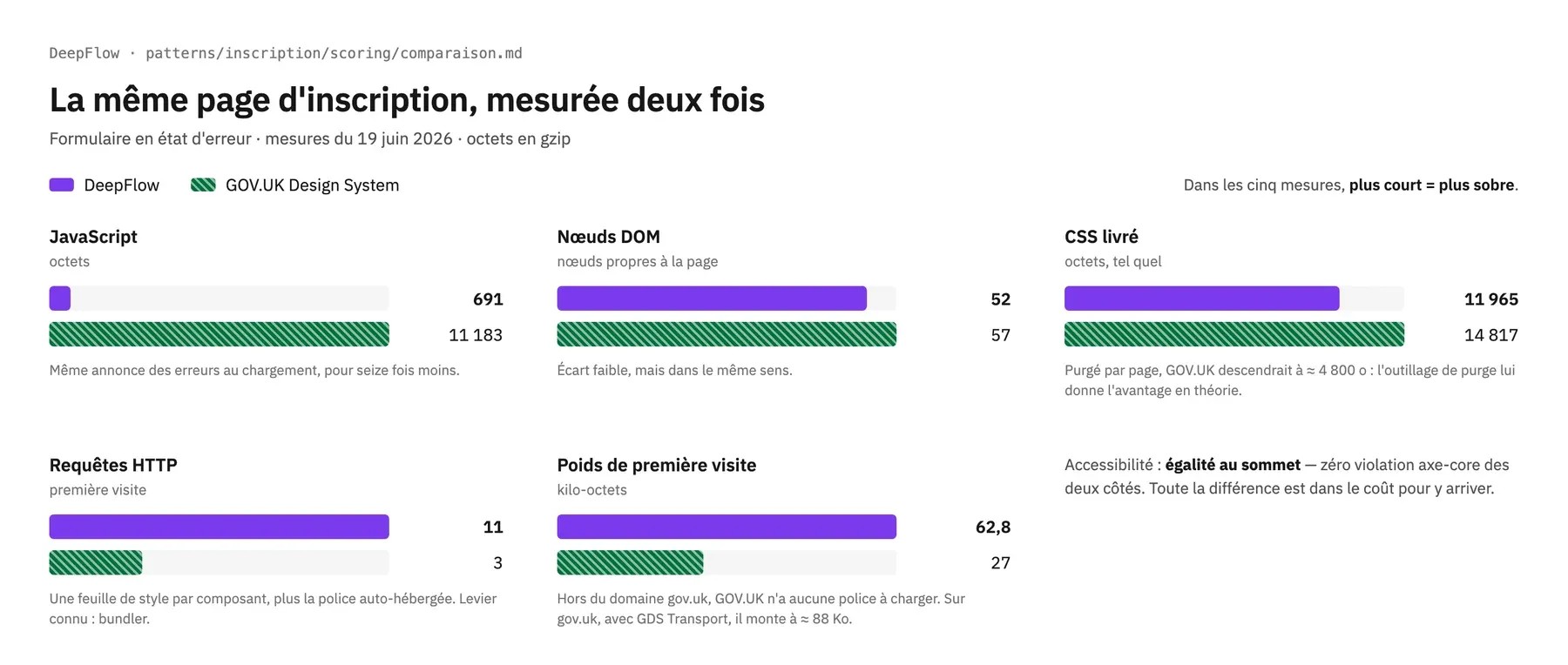
Outcome: a tie at the top on accessibility, zero axe-core violations on both sides. The difference lies in the cost. To announce errors on load, DeepFlow spends 691 bytes of JavaScript, GOV.UK spends 11,183. Sixteen times less for the same result. The DOM is leaner too (52 nodes against 57), and so is the CSS shipped (11.9 KB against 14.8).
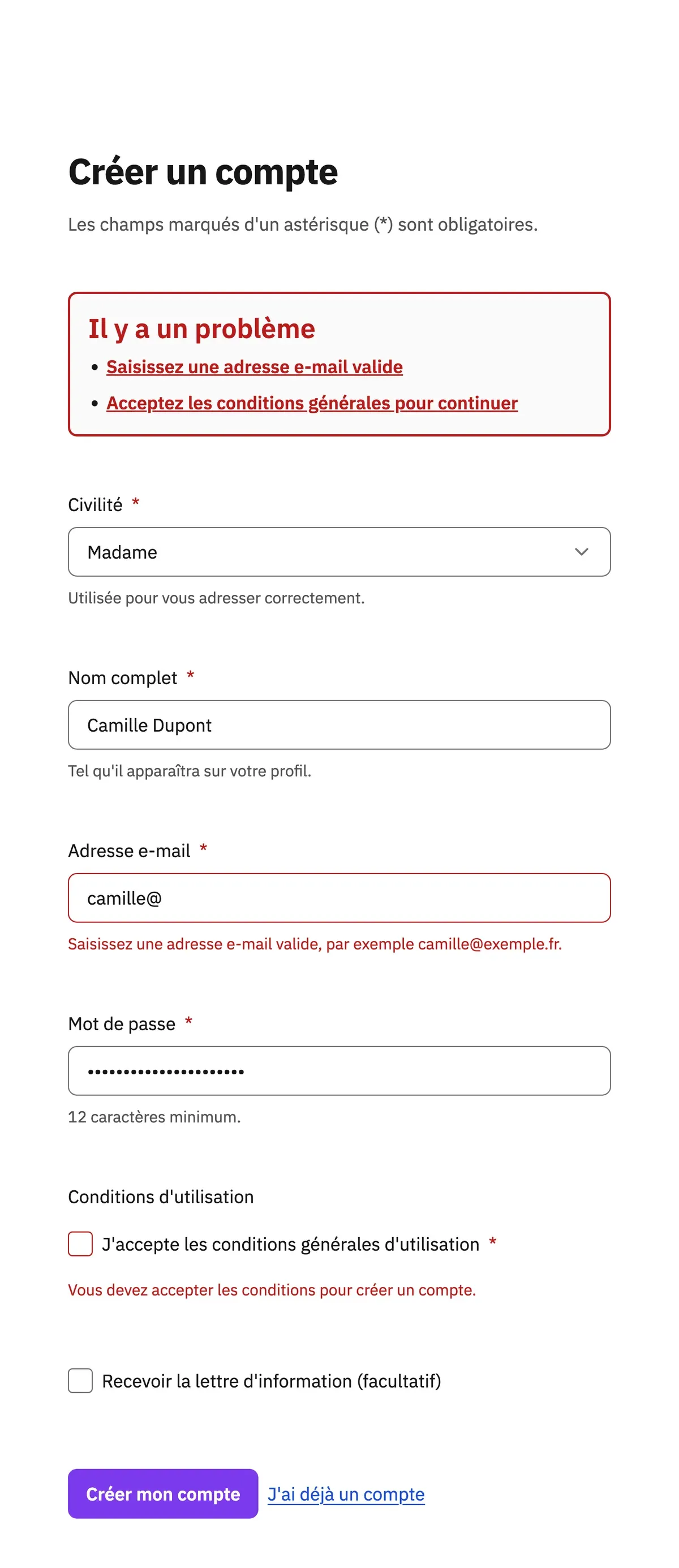
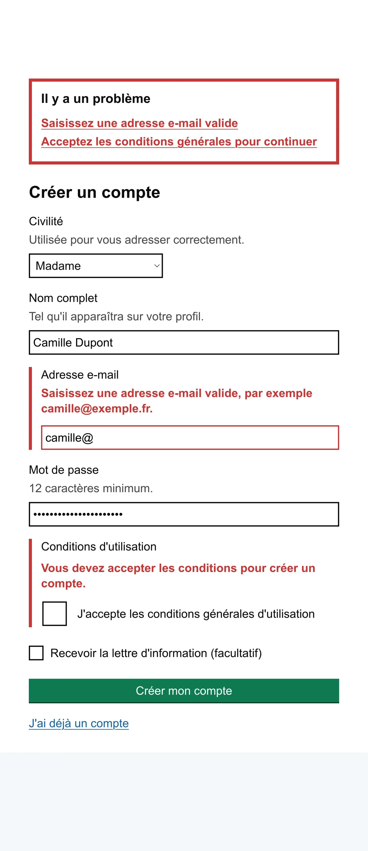
Where I lose is instructive: eleven requests against three, because I ship one stylesheet per component, and CSS that GOV.UK purges better per page. Both levers are identified, quantified, and not applied. They sit in the roadmap, not in the story.
Challenge 05 — From catalogue to product
The challenge: a compliant catalogue does not guarantee a compliant screen. That had to be verified rather than hoped for.
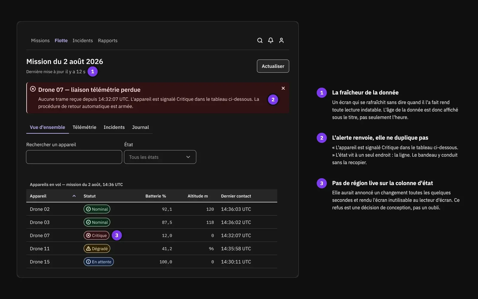
My approach: two composed patterns, at product level. The first is a sign-up page in its error state, because that is where a form's accessibility is actually settled. The second is a supervision console, which puts the five operations components to work alongside the navigation, fields and buttons of the original catalogue.
Outcome: both patterns surfaced requirements that belonged to no component.
On the form, the error summary did not exist in the catalogue. It had to
be built at page level. And announcing it turned out to be subtler than
expected: a role="alert" placed in the initial HTML is
never announced, since it only fires on insertion. The robust solution
is to move focus to the summary on load, which requires JavaScript.
Without it the page stays compliant and usable; the script only adds the
proactive announcement.
The five supervision components
Library board showing the five new components with their variants: Status Badge (4 types), Alert (4 types), Tabs (4 active-tab states), Timestamp (3 formats), Table with its sortable header cells. Dark mode preferred, consistent with the cover.
16 : 9
On the console, three decisions imposed themselves the same way. Data freshness is displayed, because a screen that refreshes without saying when it last did makes every reading undatable. The critical alert points to the table row instead of duplicating it, so there is only one source of truth. And I refused to put a live region on the status column: it would have announced a change every few seconds and made the screen unusable with a screen reader. That refusal is a design decision, not an oversight.
Documenting the system with itself
A design system nobody can consult exists only for the person who wrote it. Documentation is therefore a deliverable of the system, not an appendix.
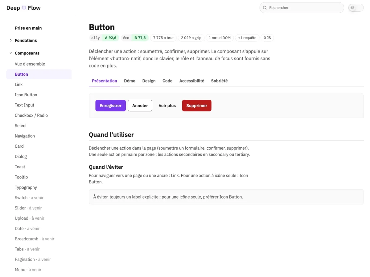
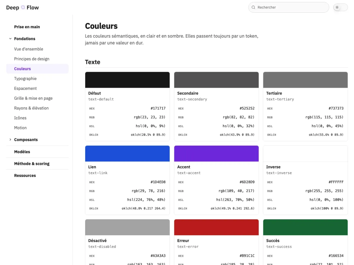
The site runs to some twenty pages: a getting-started guide, the foundations, a page per component, the composed patterns, the verification method, and an internal search. Each component page gives what it is for, when to use it, its variants, its accessibility signature and the pitfall to avoid. It is generated by a Node build of roughly a hundred lines, with no dependency at all, and its outputs are versioned: it deploys statically, with no build step on the host.
Above all it is built with the system it documents. Its own buttons, fields, cards and navigation bars are the catalogue's, with the same tokens and the same light and dark modes. It is the system's first consumer product, and the first chance to discover what is missing by actually using it.
Governing a system you maintain alone
A design system without versioning rules is a folder of files. I wrote mine before I needed them: a SemVer contract defining what breaks and what is merely an addition, a changelog, a roadmap separating what is done, in progress and planned, and an eleven-point component template applied to all twelve.
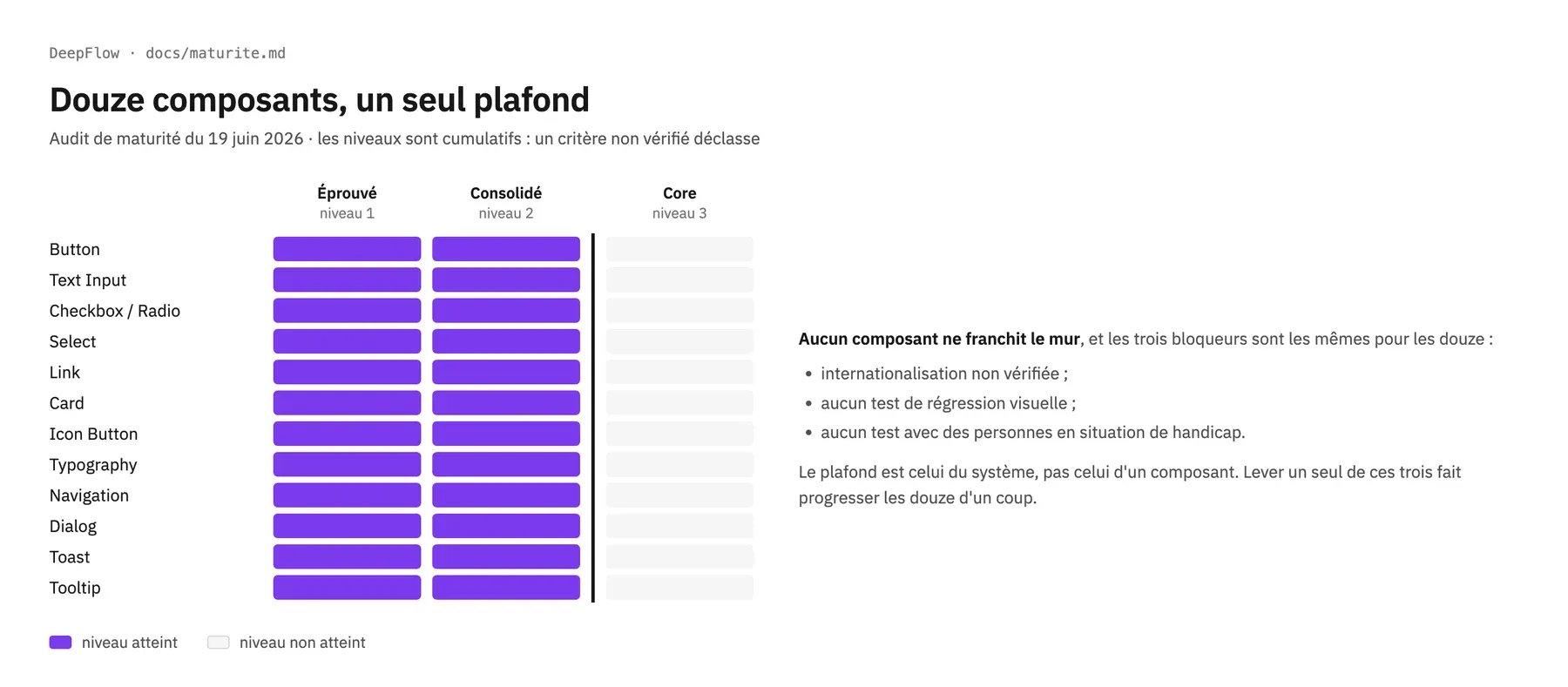
On top of that sits a three-level maturity grid, deliberately distinct from the two grades: it measures the engineering rigour around a component, not its delivered quality. The audit is instructive. All twelve prototyped components sit at the middle level, none reaches the top, and the three blockers are identical for all of them: internationalisation unverified, regression tests absent, user testing with disabled people not carried out. These are not weaknesses of one component or another, they are gaps in the system. Lifting any one of them would move the whole catalogue up at once.
Results
- Complete foundations: two-tier variables, light and dark modes, tokens exported in DTCG format to a 3.4 KB
tokens.css. - 17 components designed, of which 12 prototyped in native HTML, CSS and JavaScript, documented and verified in the browser.
- Zero axe-core violations across the prototyped catalogue, confirmed by keyboard, at 200% zoom and with a screen reader.
- Two composed patterns, including a measured comparison against the GOV.UK Design System: 16× less JavaScript at equal compliance.
- A documentation site of some twenty pages, built with the system itself and generated with no dependency whatsoever.
- Two themes obtained by a mode switch, with no component duplicated.
- Zero npm dependencies across the whole project, documentation site included.
- Written governance: SemVer, changelog, roadmap, process template, maturity grid.
What the system does not do yet
Three limits, and I would rather write them down than let them be discovered.
The weight grade is an internal rank, not an absolute score. It places a component relative to the eleven others in the catalogue. The accessibility grade, by contrast, is absolute. That asymmetry is documented and accepted, but it forbids comparing a weight letter to one from another system.
The five supervision components are designed, not yet measured. They exist in the library, with their variants, states and usage descriptions. They have neither prototype nor scoring sheet, so no grade. Assigning them one by analogy would have been the opposite of what this project argues for.
No testing has been carried out with disabled people. The audit is technical: axe-core, Lighthouse, keyboard, VoiceOver. That is the known gap against GOV.UK, and it sits at the top of the roadmap.
What I learned
The accessible choice is almost always the leanest one. I expected a permanent trade-off between compliance and lightness. Twelve times out of twelve, the native element won on both counts at once. The tension does exist, but it lies elsewhere: in the self-hosted typeface, which accounts for 73% of first-visit weight and remains an accepted legibility choice.
Verifying upfront costs less than fixing downstream. The only compliance gap found during the project was the contrast of a field border, which automated checkers do not detect. It was fixed once, by creating a reusable token, and every component built afterwards inherited the fix. Found three months later in an end-of-pipeline review, it would have had to be fixed everywhere it had spread.
The accessibility of a screen cannot be delegated to the catalogue. That is the result that surprised me most. The error summary, the data freshness, the refusal of an over-talkative live region: none of it belongs to a component. A system can be flawless in detail and still let an unusable screen through.